
GA4 and Looker Studio Numbers Don't Match: A Practical Diagnostic
Find the first point where a reporting comparison diverges. Check metric definitions, date ranges, freshness and joins before replacing a connector.
Published October 13, 2026

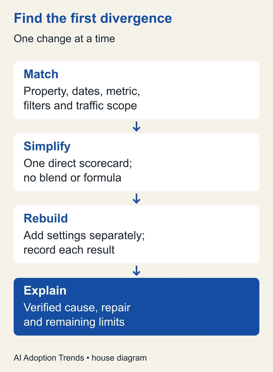
When your Analytics dashboard disagrees with Google Analytics 4, compare one metric for one property and one completed date range before replacing a connector. Most useful investigations begin by removing complexity: no blended data, no custom formula, no hidden comparison period, and no ambiguous label such as Users. Rebuild the comparison one field at a time and record where the numbers first diverge.
This guide is for a marketing manager or agency reporting lead who needs to explain a discrepancy before sending a client report. It applies to Google's dashboard product commonly searched as Looker Studio; current Google documentation calls it Data Studio. The method also helps when data passes through a reporting connector or spreadsheet. It does not promise that independently processed reports will always match exactly.
The worked examples are constructed, with invented counts. They demonstrate two common mistakes: adding daily unique-user counts and multiplying a metric through a data join. The proposed checklist is an editorial troubleshooting method. Product definitions and documentation were checked on October 13, 2026. Use your own property, report settings, and approved access when applying it.
Decide whether the discrepancy changes a business decision
Write down the disputed number and its consequence. “The client dashboard shows 1,260 users while Analytics shows 980, which changes our reported cost per user” is actionable. “The tools look different” is not. Save a screenshot or export of both reports, including the date range and field names, before making edits. That prevents a refresh or a colleague's change from erasing the original evidence.
Assign a reporting owner and a data owner. The reporting owner reconstructs the chart; the data owner confirms the property, event definitions, and collection rules. In a small business one person may fill both roles, but the questions remain separate. Do not change tracking, consent settings, or production tags just to make a presentation agree with a spreadsheet.
Start with access you already have. You need read access to the relevant Analytics report and enough permission to inspect or copy the dashboard configuration. A connector purchase is not a prerequisite for this diagnostic. Budget an initial review session and a follow-up only if a concrete issue remains. If the mismatch concerns a billing or contractual metric, have the responsible owner decide which agreed definition governs that decision.
Create a comparison card with exact settings
Record property ID, website or app stream, date range, property time zone, report name, metric, dimensions, filters, reporting identity, connector, and data-refresh time. Reporting identity is the method Analytics uses to recognize users across their activity. If you cannot establish a setting, mark it unknown rather than copying the value from the other report. Unknowns are work items.
Choose a completed period rather than today while investigating. That reduces the chance that processing and refresh timing explain the difference, although it does not eliminate every later adjustment. Use the same start and end dates and check whether a chart overrides the report's date control. A dashboard can contain one card for the current month and another for the last 30 days without making the distinction obvious to its reader.
Match the exact metric. Google's user-metric definitions distinguish Total users, Active users, New users, and Returning users. Total users and Active users do not answer the same question. Rename dashboard cards with the precise metric instead of shortening every field to Users. Make the title meaningful before discussing why one count is larger.
Match the traffic-source question as well. Google's acquisition-report comparison distinguishes the source that first acquired a user from the source of a session. A first-user channel report and a session-channel report can legitimately assign activity differently. For the question “What brought visits this month?”, begin with the session-based report; for initial audience acquisition, use the first-user view.
Rebuild one card without blends or calculated fields
Make a diagnostic copy of the report so the client-facing version stays stable. Add a single scorecard connected directly to the intended Analytics property. Select the exact metric and date range from your comparison card. Remove optional dimensions and filters for the initial test, while ensuring you do not broaden access or expose another client's data. Record the result before reintroducing each setting.
If the simplest card agrees, add the original chart's dimensions, filters, and calculations one at a time. When the discrepancy appears, you have isolated a change worth examining. If it already differs, inspect the connector settings, source processing, and reporting method. Avoid rebuilding the entire dashboard; changing five things together makes it difficult to know which one mattered.
Check freshness at the data-source level and inspect the report's last update. Google's freshness documentation explains that reports can reuse stored query results and that refresh options depend on the connector. Check the actual options in your data source rather than assuming every source updates at the same interval. A manual refresh cannot recover events that were never collected or force unfinished source processing to complete.
Keep a diagnostic log: time, setting changed, before count, after count, and conclusion. If refreshing produces agreement, describe that as an observed refresh-related discrepancy for the tested period. Do not claim the underlying data problem is permanently fixed until the next normal refresh also behaves as expected. Repeated delays may call for a reporting cutoff rather than new software.
Why daily users do not add up to monthly users
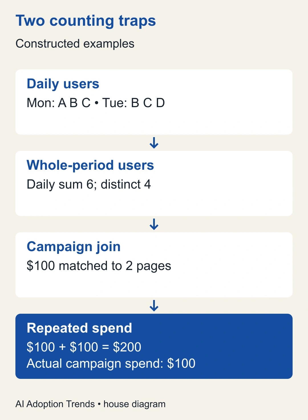
Imagine Monday contains three recognized users: A, B, and C. Tuesday contains B, C, and D. The daily counts are three and three, but the distinct users across both days are A, B, C, and D: four. Adding the daily values produces six appearances in daily counts, not six distinct people over the combined period. This is set arithmetic, not a measured Analytics result.
A spreadsheet connector may export one row per day. Summing a daily unique-user column to create a monthly card can therefore answer a different question from querying unique users for the full month. Ask the source for the period-level user metric instead of reconstructing it by addition. The same caution applies when users can appear in several pages, channels, or campaigns.
Do not assume every metric has this behavior. Event counts and many transaction amounts can often be summed under a consistent definition, while distinct users require attention to repeated membership. Sessions also need the correct source definition and grouping; do not infer their aggregation rules from the word count. Let the source compute the desired period metric where possible, and document any transformation.
Google's explanation of Analytics reports versus BigQuery exports identifies additional reasons for differences, including user definitions and estimation. A raw-event warehouse query is not automatically the same calculation as an Analytics report. If your dashboard uses BigQuery, compare the implemented logic, not just the visible field name. Escalate unresolved method differences to the analyst responsible for that query.
A join can duplicate a perfectly correct source value
A join combines rows from two sources using a matching field. In a constructed example, a campaign table has one row for Campaign A with $100 of spend. A second table has two rows for Campaign A, one for each landing page. Joining only on campaign and summing spend after the join can produce $200 because the $100 value appears on both matched rows. The ad platform has not doubled its bill; the report has repeated a value.
The right repair depends on the question. If you need campaign-level results, summarize each source to one row per campaign for the same period before joining. If you need landing-page spend, obtain a supported allocation or page-level source rather than pretending campaign spend belongs in full to every page. Do not divide by the number of rows unless that allocation is explicitly the business method you intend.
Google's blending guidance warns that multiple matches can increase the rows in blended data. Check what one row represents in each source and whether the join fields uniquely identify it. Add date, account, or other necessary keys only when both datasets support the same meaning. A longer key is not automatically a correct key.
Keep an unblended total beside the blended chart during testing. Compare row counts and totals before and after the join. Use a tiny invented dataset like the $100 example to show a nontechnical colleague why the mismatch occurs. Once the repaired blend passes, label the report's unit of analysis: campaign per month, landing page per day, or another explicit combination. That label is a useful maintenance note for the next editor.
Keep Search Console clicks separate from Analytics sessions
Search Console measures activity in Google Search; Analytics measures collected activity on your website or app. Google's guide to using both tools explains that clicks and sessions are different measures and will not match completely. It also describes differences involving consent and tracking, time zones, and canonical URLs. A dashboard should show the relationship without presenting a forced reconciliation as fact.
For example, a person can click a search result but prevent Analytics collection through their browser or consent choice. Search Console also uses Pacific Time for its standard daily reporting, while an Analytics property has its own configured time zone. A day boundary can therefore differ. Do not change the property's time zone casually; document the comparison and choose a reporting method appropriate to the decision.
Use Search Console for the question “Are we appearing and earning clicks in Google Search?” Use Analytics for “What do measured visitors do after arriving?” Put confirmed business outcomes, such as accepted enquiries or new subscriptions, in their own measured section. Do not report a button click as a completed signup unless the implementation actually confirms that outcome.
Use AI to organize the investigation, not invent the answer
Give an approved assistant a sanitized comparison card and the observed test results. Ask: “List the settings that differ between these two reports. Separate verified differences from possible explanations. Propose the next smallest test, identify what result would support each explanation, and do not infer a tracking failure without evidence.” Keep account identifiers, customer information, and unnecessary raw records out of the prompt.
An acceptable response helps prioritize checks: metric mismatch first, period mismatch second, blend behavior third. It should not announce that consent caused a 20% gap when you have not measured that. Have the reporting owner perform the tests and add results. AI can turn the log into a client explanation after the facts are established, with the unresolved portion plainly stated.
Close the issue with a definition and a repeatable check
Your handoff should contain the original discrepancy, identified cause, exact repair, before-and-after comparison, and remaining limitations. Use plain language: “The old card added daily unique-user counts. The replacement requests unique users for the full reporting period.” That is more useful than “We optimized the data connection.” Preserve the diagnostic copy so a future editor can reproduce the reasoning.
Stop making changes if each experiment alters the scope, source, and calculation simultaneously, or if the remaining discrepancy cannot be explained from accessible evidence. Escalate with the comparison card and minimal example. A small reproducible case is a better support request than a large dashboard with an unexplained red number.
Before buying a replacement reporting connector, repeat the exact diagnostic with the proposed tool. The site's Coupler.io alternatives guide helps choose by the reporting job once that job is clear. For today, the useful deliverable is one trustworthy metric card and a written definition that the client, analyst, and dashboard all share.
Weekly Newsletter
AI Adoption Weekly
New research, field guides, training studies, and tool decisions for operators.
No spam. Unsubscribe anytime.
Related Comparisons
Calculator
AI seat cost calculator
List price × headcount. You enter the hours and the operating assumptions.